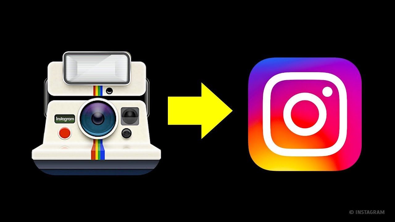
Back in the 19th and 20th centuries, before the computer era, company logos were made in 2D. But what’s happening now? We're getting rid of skeuomorphism (watch the video to know what it is). The time of 3D has passed, and we’re going back to 2D. Everything changed literally in one day. But don’t worry, it’s for the better! Other videos you might like: 16 FAMOUS LOGOS WITH A HIDDEN MEANING (That We Never Even Noticed) https://www.youtube.com/watch?v=UKc271fj2ok& Logo Challenge: Which One is Correct? https://www.youtube.com/watch?v=Wt3hmy4JWng 12 Facts About Famous Logos You Didn’t Know https://www.youtube.com/watch?v=FMmwAV1uzJ4& TIMESTAMPS: The 1976 Apple logo 0:13 What started the era of logos as we know them 0:50 Why designers decided to use 3D 1:40 The ancient civilizations use the skeuomorphic style, too 3:16 The day when everything changed 4:34 So why the Apple logo changed so much 6:35 Preview photo credit: Instagram old and new logos: By Instagram, http://bit.ly/1kwsCwF Animation is created by Bright Side. Music by Epidemic Sound http://bit.ly/1NOjjY3 SUMMARY: - Old logos were often quite elaborate, as if companies tried to outwit one another and just didn’t know where to stop. - By the end of the century, companies understood that their customers didn’t need to see works of art — they needed something that caught their eye and kept their attention. - When the first touch screens appeared, all the icons on them had to be pressed with a bit of force and were made to imitate buttons. - Company logos went through the same transformation. When the Internet appeared to the public, not everyone was ready to accept the transition from the real world to the virtual one. - In fact, even the ancient civilizations used this skeuomorphic style. For instance, the long rows of cubes along the seams of many Greek structures imitated wooden rafters in old buildings. - To avoid mass confusion, companies started using 3D logos for themselves and 3D icons for their devices, which imitated items from the physical world. - Apple, being the trendsetter in the digital world, presented its new iOS 7 design on June 10, 2013, and was the first to get rid of the skeuomorphism. - Icons on mobile devices became completely flat, ditching the realistic look and animation. Naturally, many people were disappointed with the changes, but in the end, it proved to be an ingenious solution. - Today, people want to perceive maximum information with minimum effort, and the new 2D style is about just that. - New times require new changes, and although we, as consumers, may not think much of it, we’ll always choose something modern and up-to-date over old-fashioned and obsolete. Subscribe to Bright Side : https://goo.gl/rQTJZz ---------------------------------------------------------------------------------------- Our Social Media: Facebook: http://bit.ly/1NR4JJP Instagram: http://bit.ly/2pDikkf 5-Minute Crafts Youtube: http://bit.ly/2pNb6gr Photos: http://bit.ly/23rGg9b East News ---------------------------------------------------------------------------------------- For more videos and articles visit: http://bit.ly/2d8ayZz
Tags:
Bride Side
